Modern kitchen design colors do more than shape how a space looks they quietly shape how it feels to live in it.
You can walk into two kitchens with the same layout and the same cabinets and one feels calm, while the other feels strangely stressful. Nothing is obviously wrong, but you don’t want to linger.
Cooking feels like a task instead of a rhythm. Meals feel rushed. You may not realize it, but color is often the quiet reason why.
Most people choose modern kitchen colors because they look clean, stylish, or Pinterest approved. White feels safe. Gray feels modern. Black feels bold.
But what we rarely talk about is how those colors actually behave once real life moves in when you’re cooking on a weekday evening, feeding a family, or standing in the kitchen wondering why you’ve lost motivation to cook altogether.
Color doesn’t just decorate a modern kitchen. It shapes how the space feels when you’re tired. It influences appetite, focus, and even whether cooking feels grounding or draining.
This is why some modern kitchens feel welcoming without trying and others look beautiful but never quite feel right.
If you’ve ever loved the idea of a modern kitchen but struggled to feel comfortable in one, this post is for you.
We’re going to talk about modern kitchen design colors in a way that goes beyond trends looking at how color affects mood, appetite, and daily life, and how to choose shades that support the way you actually live.
Because a modern kitchen isn’t just about looking good online. It’s about feeling good when you’re standing in it, day after day.
How Color Psychology Shapes Modern Kitchens
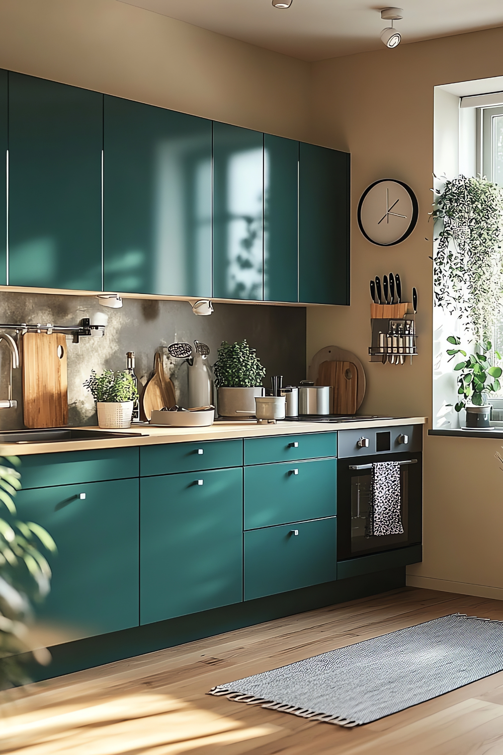
Most people don’t think about psychology when choosing kitchen colors. They just know something feels off. The kitchen looks fine, but cooking feels tiring. The space feels cold, or strangely heavy, or not very inviting. Over time, you find yourself rushing meals or avoiding the kitchen altogether without knowing why.
This is where color psychology quietly comes in.
Color affects energy levels more than we realize. Some colors wake us up and keep us alert. Others slow us down and help us feel settled. In a kitchen, this matters because cooking already asks a lot from us attention, movement, decisions.
When the color around you feels harsh or draining, that effort feels heavier than it needs to be.
Color also influences appetite. This doesn’t mean a kitchen color will make or break your eating habits, but it does shape how relaxed or rushed meals feel.
Here’s a detailed breakdown of how color affects appetite and cooking
Calm, balanced colors support slower cooking and more mindful eating. Overstimulating colors can do the opposite, even if they look exciting at first.
Then there’s comfort while cooking. A kitchen is a working space, but it’s also where people gather, talk, and pause.
When color is chosen with intention, the space feels supportive instead of demanding. You’re more likely to linger, experiment, or enjoy being there.
Designers use color psychology in modern kitchens to solve very practical problems. Light, softer colors can make a small kitchen feel more open. Muted tones reduce visual stress, especially in open plan homes. Deeper colors, when used carefully, can create a sense of focus and calm instead of chaos.
Color never works alone, though. Light, surface finishes, and color all work together. A soft color can feel harsh under bright lighting. A dark color can feel warm and grounded with the right finish. Matte surfaces absorb light and feel calmer. Glossy surfaces reflect light and add energy. The same color can feel completely different depending on how these elements interact.
Understanding this is important, because it explains why copying a kitchen color from online photos doesn’t always work in real life. Modern kitchens feel good not because of one perfect shade, but because color, light, and materials are working in quiet harmony.
Once you understand this relationship, choosing modern kitchen colors becomes less about guessing and more about intention. And that’s what prepares you to make confident choices in the next section.
Best Modern Kitchen Design Colors (And How to Choose Without Regret)
This is where modern kitchen design colors really start to matter not in photos, but in daily life.
Most people don’t struggle with liking a color. They struggle with living with it.
A kitchen color can feel beautiful online and exhausting in real life. It can look calm in the morning and heavy at night. It can make cooking feel easy or strangely draining. That’s why designers return to the same color families again and again. They work because they support how people actually use their kitchens.
Below, each color group is explained not just by style, but by mood, appetite, and lifestyle fit, so you can avoid second guessing later.
Neutral Modern Kitchen Colors
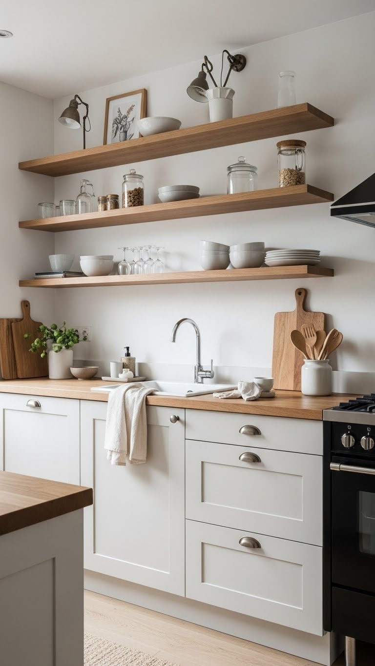
Examples: white, off‑white, beige, greige
Neutrals dominate modern kitchens because they solve one very real problem: visual overload.
Kitchens are busy by nature appliances, movement, sound, mess. Neutral colors act like a pause button. They don’t compete with food, people, or light. They let everything else breathe.
Mood:
Neutral kitchens feel clean, calm, and emotionally safe. Your eyes don’t have to work hard, which helps the space feel less stressful especially after a long day.
Appetite:
Neutrals don’t push appetite up or down. Meals feel steady and familiar. This is why neutral kitchens are often described as “easy to live with.” They don’t rush you, and they don’t overwhelm your senses.
Best for:
-
Small kitchens that need to feel larger
-
Minimalist or clutter sensitive homes
-
People who want a kitchen that ages well
Real‑life example:
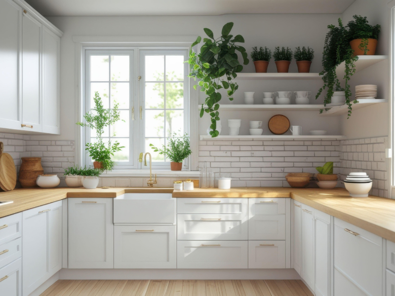
Off‑white cabinets, warm wood shelves, and simple hardware. The kitchen feels modern, but never cold a space that works whether you’re cooking alone or hosting.
Warm Modern Kitchen Colors
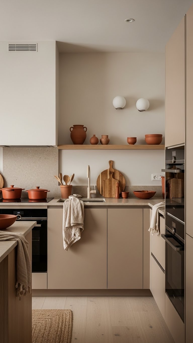
Examples: warm beige, soft terracotta, muted browns
One of the biggest complaints about modern kitchens is that they can feel too sleek almost unfinished. Warm colors fix that.
They bring back the human feeling without turning the kitchen traditional or heavy.
Mood:
Warm modern kitchens feel welcoming and grounded. People linger longer. Conversations last a little more. The space feels lived‑in, not staged.
Appetite:
Warm tones gently support appetite. They encourage slower cooking and more relaxed meals, which is why these kitchens often feel comforting rather than rushed.
Best for:
-
Family kitchens
-
Open plan homes
-
People who use their kitchen as a gathering space
Real‑life example:
Warm beige cabinets with soft terracotta accents and natural textures. The kitchen still feels modern, but it no longer feels distant or sterile.
Cool Modern Kitchen Colors
Examples: soft gray, muted blue, sage green
Cool tones are often chosen because they look modern but their real strength is how they organize the space emotionally.
Mood:
Cool colors create calm, focus, and order. They reduce visual noise, which helps cooking feel more controlled and less chaotic.
Appetite:
Cool kitchens naturally keep appetite subtle. They don’t overstimulate, which can support lighter meals and more mindful eating.
Best for:
-
People who like clean, uncluttered spaces
-
Homes where the kitchen doubles as a quiet workspace
-
Anyone easily overwhelmed by color
Real‑life example:
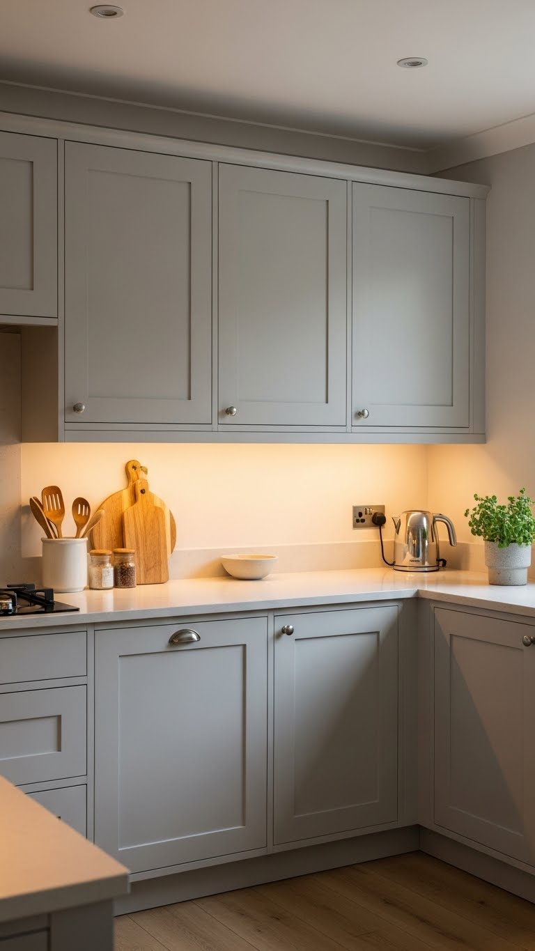
Soft gray cabinets with matte finishes, paired with warm lighting. The space feels modern and serene, not cold or clinical.
Dark Modern Kitchen Colors
Examples: charcoal, navy, matte black
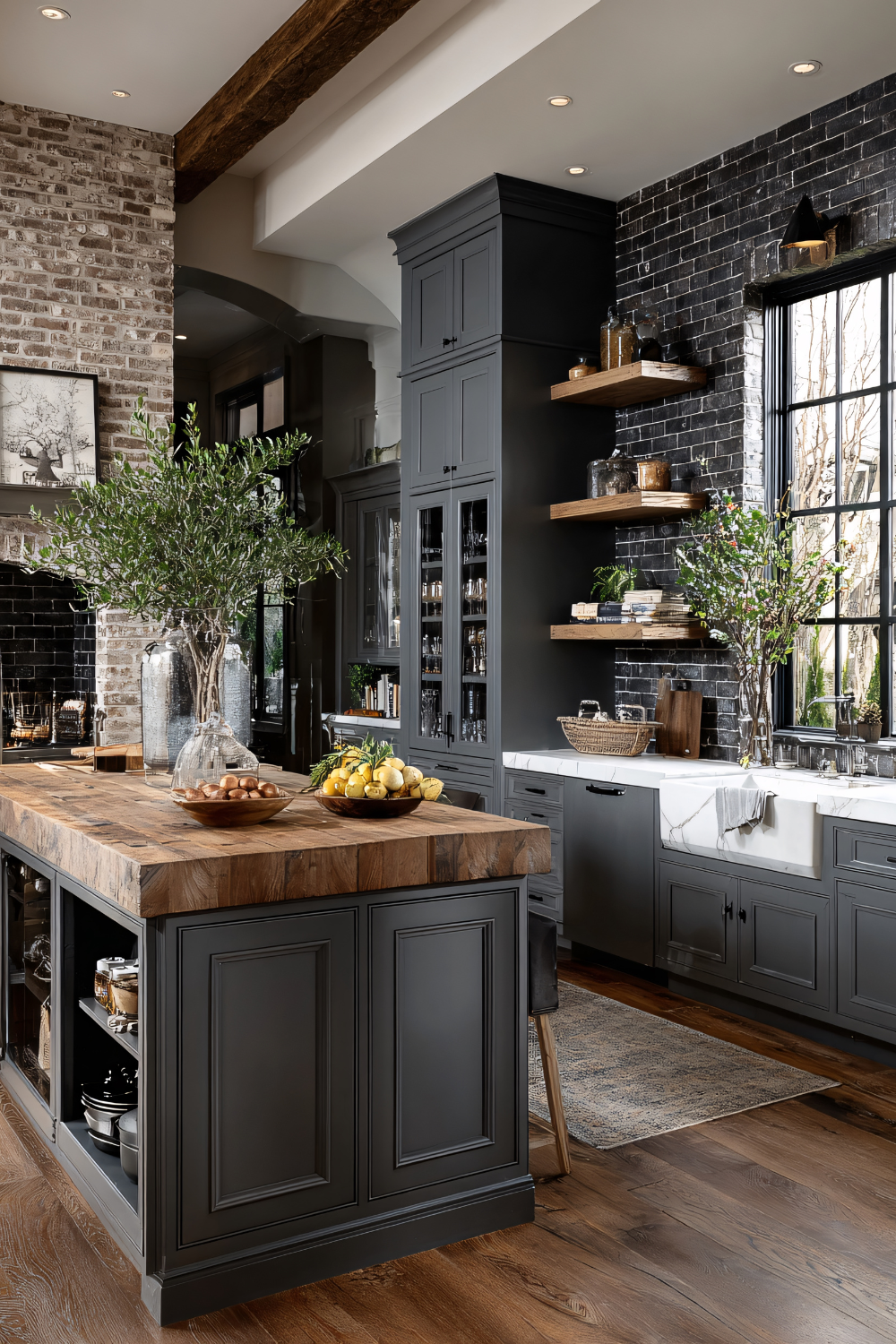
Dark kitchens aren’t about drama they’re about intention. When done right, they solve the problem of kitchens that feel too exposed or overstimulating.
Mood:
Dark modern kitchens feel sophisticated, grounded, and intimate. They create a sense of enclosure that can be deeply calming.
Appetite:
Dark colors slow things down. Meals feel more deliberate and relaxed, which can be comforting in fast‑paced homes.
Best for:
-
Kitchens with good natural light
-
Larger spaces
-
Homes that want a calm, moody atmosphere
When to be careful:
In small or poorly lit kitchens, dark colors can feel heavy instead of soothing.
Real‑life example:
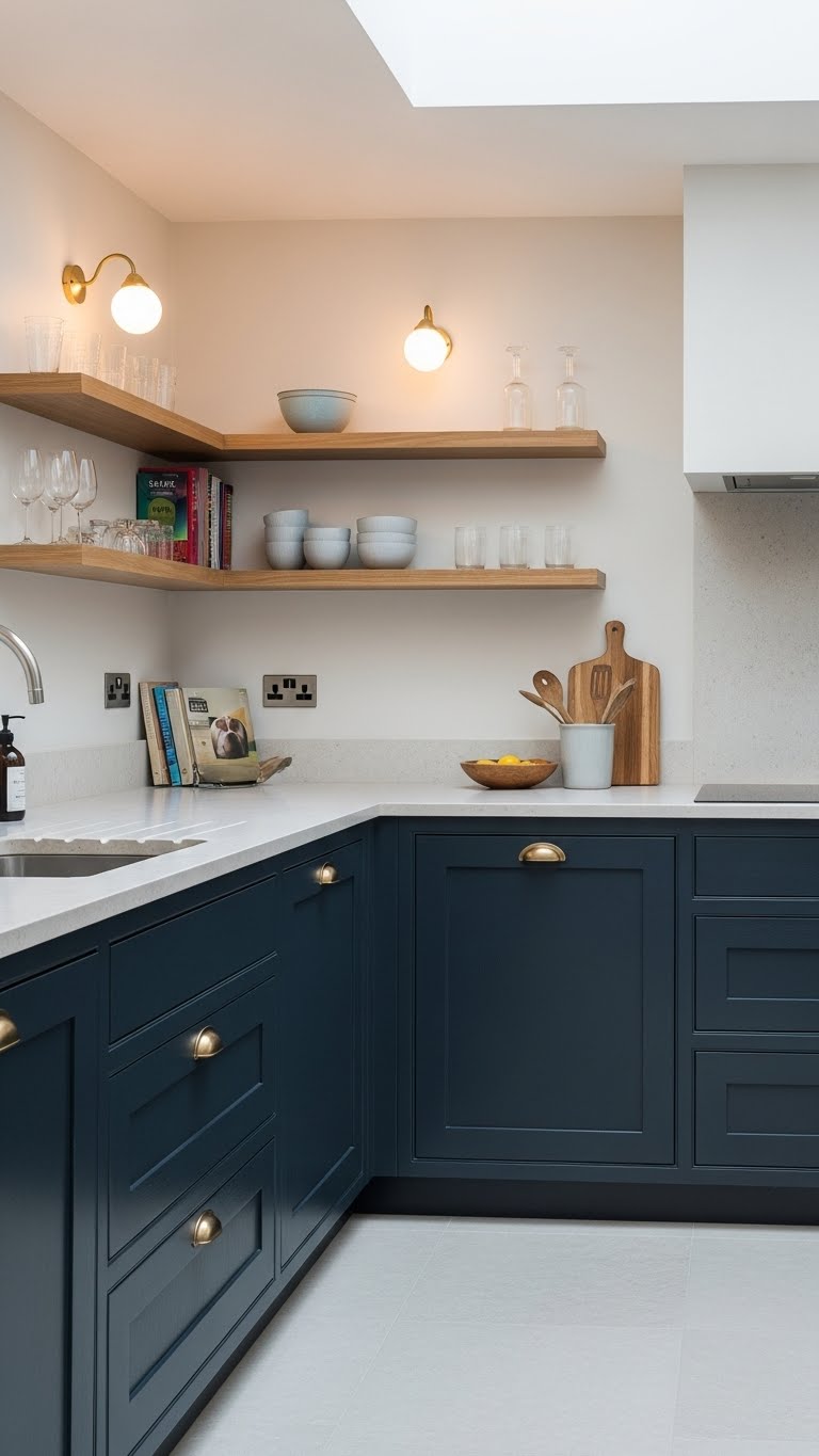
Navy lower cabinets paired with light countertops, warm wood, and soft lighting. The result feels rich and modern not overwhelming.
The Real Takeaway
Each of these modern kitchen design colors works but not for the same life.
The mistake most people make isn’t choosing the “wrong” color.
It’s choosing a color that doesn’t match how they cook, eat, and move through their days.
The best modern kitchen color isn’t the one that looks best online.
It’s the one that quietly supports your mood, your appetite, and your everyday rhythm.
Modern Kitchen Colors to Be Careful With
Not every beautiful color works well in a modern kitchen especially long‑term. This is where many people feel stuck. A color looks stunning online, but living with it every day feels very different.
Bright, high‑saturation colors are usually the biggest challenge. Think bold reds, loud yellows, electric blues, or trendy statement colors that demand attention the moment you walk in. In a modern kitchen, these shades can quickly overwhelm the space.
Visually, strong colors create noise. Instead of feeling calm and balanced, the kitchen starts to feel busy even when the layout is clean. This can make cooking feel more stressful and the room harder to relax in.
There’s also an appetite connection. Very bright or intense colors can overstimulate the senses. Some people feel rushed when eating in these spaces. Others lose their appetite altogether. Modern kitchens are meant to support everyday rhythms, not fight against them.
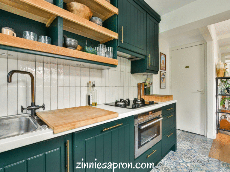
This doesn’t mean you must avoid color completely. It simply means modern kitchens do better with muted versions instead. A softened sage instead of bright green. A warm clay tone instead of sharp orange. A dusty blue instead of cobalt.
Muted colors still add personality they just do it quietly. And quiet confidence is what modern design does best.
How to Choose the Right Modern Kitchen Color for Your Lifestyle
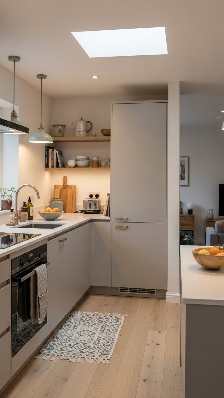
The best modern kitchen design colors isn’t the trendiest one. It’s the one that fits how you actually live.
Before choosing a color, pause and ask yourself a few honest questions.
Do you cook often or only occasionally?
If your kitchen is used daily, calmer colors tend to feel better long‑term. They reduce visual fatigue and make everyday tasks feel lighter.
Do you want energy or calm?
Some people want their kitchen to feel lively and social. Others want it to feel peaceful and grounding. Warm tones often support connection and comfort, while cool tones support focus and order.
Is your kitchen social or private?
In open‑plan homes, kitchen colors need to flow into nearby spaces without stopping the eye. Softer, balanced colors usually work best here.
Lighting also matters more than most people realize. Natural light can soften strong colors or cool down warm ones. Artificial lighting can change everything especially in the evening. This is why a color that looks perfect in a store can feel completely different at home.
Surface finishes matter too. Matte finishes absorb light and feel calm and modern. Glossy finishes reflect light and feel sharper. The same color can feel relaxed or intense depending on the finish you choose.
Choosing modern kitchen colors isn’t about rules it’s about alignment. When color matches your lifestyle, the kitchen starts to support you instead of competing for attention.
How Color and Light Work Together in Modern Kitchens
Color never exists on its own. Light is always part of the conversation.
Natural light changes modern kitchen colors throughout the day. Morning light can make colors feel fresh and soft. Afternoon light can warm them up. Evening light can deepen them and make them feel heavier.
Harsh light especially bright overhead lighting can make cool colors feel cold and dark colors feel intense. Softened light creates balance and makes colors feel more livable.
This is where window treatments quietly matter. They don’t just block light they shape it. Gentle filtering light can soften strong tones and add warmth to cooler palettes.
If you want to explore this more, this connects beautifully with:
3 Gentle Ways to Use Window Coverings to Make Your Home Feel Softer
When color and light work together, the kitchen feels intentional not accidental.
Quick Modern Kitchen Design Tips Designers Use
This is where professionals keep things simple.
Limit your palette to 2–3 main colors
Too many colors create visual stress. Fewer colors create flow.
Let one color lead
Choose a main color and let the others support it quietly.
Use contrast on purpose
Light and dark work best when they balance each other, not compete.
Keep transitions soft in open‑plan homes
Modern kitchens should blend into surrounding spaces, not stop abruptly.
These small choices make a big difference in how a kitchen feels day after day.
Letting Color Support the Way You Live
Modern kitchen design isn’t just about clean lines or stylish cabinets. Color shapes how you cook, eat, and gather often without you noticing.
The best modern kitchen design colors balance mood, appetite, and simplicity. They support your daily routines instead of distracting from them.
When you choose color with intention, your kitchen becomes more than a design choice. It becomes a space that feels calm, welcoming, and easy to live in.
Choose what supports your life not just what looks good online.

